Holy Grail Layout using CSS Grid via Tailwind
We are going a bit meta today and will be working on this blog. I used this lovely tutorial to set it up. It is powered by Fresh, a new framework from the Deno folks. You can check the source code here.
Goals
- implement page layout to accomodate a header and a footer
- sanctify afrontmentioned page layout
- use Tailwind
The last one is there because I have not used Tailwind up until now and I want to try it out.
Execution
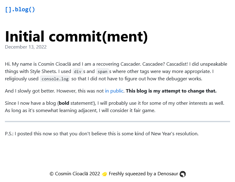
Let's look at the blog post page:
You might be thinking: "But Cosmin, this looks so slick and minimal. I love
it!". That's obviously the case, but at the same time it's also just rendered
Markdown, and a blog needs a bit more than that. Namely, let's add a layout with
a <header> and <footer>.
We're going to create a new file, components/Layout.tsx:
import { ComponentChildren } from "preact";

export default function Layout(props: { children: ComponentChildren }) {
  const { children } = props;
  return (
    <div>
      <header>header</header>
      <main>{children}</main>
      <footer>footer</footer>
    </div>
  );
}
We already have a max-width container on the blog post content, but we are
going to need this for the <header> and <footer> as well. Let's create
components/Container.tsx:
import { ComponentChildren } from "preact";

export default function Container(props: { children: ComponentChildren }) {
  const { children } = props;
  return (
    <div class="max-w-screen-md px-4 mx-auto">
      {children}
    </div>
  );
}
We can now use this in Layout:
import { ComponentChildren } from "preact";
import Container from "./Container.tsx";

export default function Layout(props: { children: ComponentChildren }) {
  const { children } = props;
  return (
    <div>
      <header>
        <Container>header</Container>
      </header>
      <main>
        <Container>{children}</Container>
      </main>
      <footer>
        <Container>footer</Container>
      </footer>
    </div>
  );
}
This allows us to have the full-width page sections, but with the content
restricted to the Container. This brings flexibility in terms of styling.
Let's also tidy up the blog post page ([slug].tsx):
export default function PostPage(props: PageProps<Post>) {
  const post = props.data;
  return (
    <>
      <Head>
        <style dangerouslySetInnerHTML={{ __html: CSS }} />
      </Head>
      <Layout>
        <div class="py-8"> <!-- We only need some vertical padding here now -->
          <h1 class="text-5xl font-bold">{post.title}</h1>
          <time class="text-gray-500">
            {new Date(post.publishedAt).toLocaleDateString("en-us", {
              year: "numeric",
              month: "long",
              day: "numeric",
            })}
          </time>
          <div
            class="mt-8 markdown-body"
            dangerouslySetInnerHTML={{ __html: render(post.content) }}
          />
        </div>
      </Layout>
    </>
  );
}
Sooo... let's get to the Holy Grail thing. For those of you who don't know what I'm talking about, The Holy Grail Layout looks something like this:
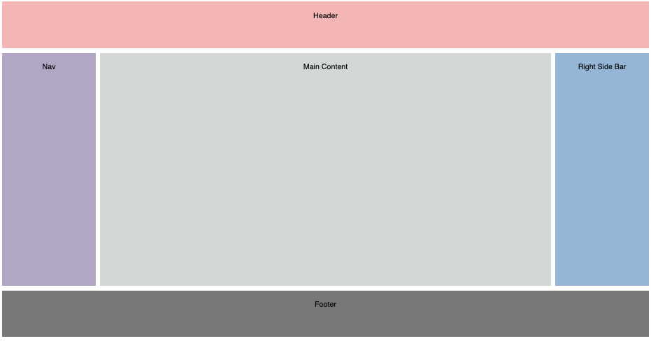
The aim is to have a header, a main content area (with fixed-width sidebar on the left, content in the middle and a fixed-width sidebar on the right) and a footer. If there is not enough content in the main content area, this should extend so that the footer sticks to the bottom of the page.
While I do believe this could be useful for the blog in the future, what I need right now is everything except for the sidebars.
Doesn't that mean we just need a sticky footer? Well, yes. However, that title would not bring me a gazillion readers. Also, we will be building this so that we can easily extend it later to add the sidebars.
Everything we want to achieve here can be done with a CSS rule like the following:
/* equivalent Tailwind utility classes in comments below, next to declarations */
.holy-grail {
  display: grid; /* grid */
  grid-template-rows: auto 1fr auto; /* ? */
  grid-template-columns: minmax(0, 1fr); /* grid-cols-1 */
  height: 100vh; /* h-screen */
}
Tailwind has nice
CSS Grid utilities, but what
we need for the rows is not baked in. There are multiple ways to solve this, but
let's do this via tailwind.config.ts (twind.config.ts in Fresh):
import { Options } from "$fresh/plugins/twind.ts";

export default {
  selfURL: import.meta.url,

  theme: {
    extend: {
      gridTemplateRows: {
        "holy": "auto 1fr auto", // -> utility class `grid-rows-holy`
      },
    },
  },
} as Options;
We can now apply all needed classes to the root of our layout:
// Layout.tsx
return (
<div class="grid grid-cols-1 grid-rows-holy h-screen">
<header>
<Container>header</Container>
</header>
<main>
<Container>{children}</Container>
</main>
<footer>
<Container>footer</Container>
</footer>
</div>
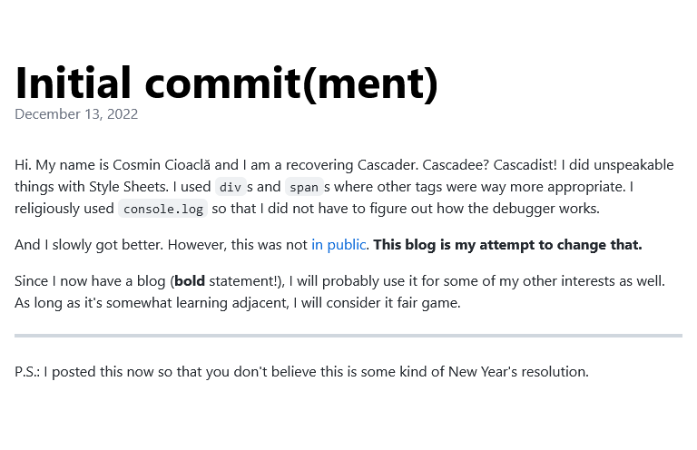
);After adding some appropriate content for the header and the footer, we end up with:
Success!
Conclusion
We've reached all our goals, with the small caveat that the holy grail layout is more of a holy grail light layout. Fewer calories FTW!